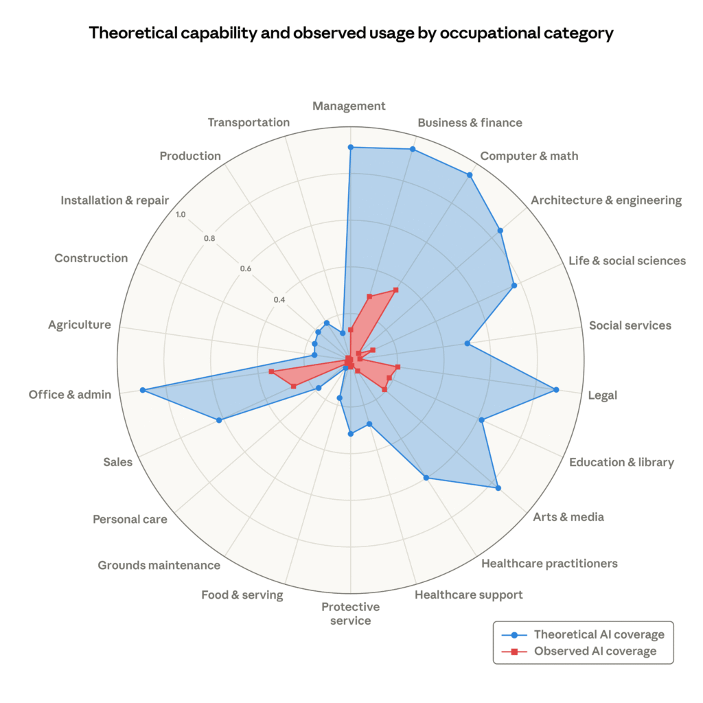
You’ve probably seen that graph floating around. The one from Anthropic’s labor market report, with the red blob showing how much AI is actually being used across 22 job categories, and the massive blue blob showing where it could theoretically go.
At first glance, the blue area is terrifying. It suggests LLM-based systems could handle at least 80 percent of tasks in everything from Arts & Media to Office & Admin, Legal, Business & Finance, even Management. If you’re in any of those fields, it looks like Anthropic is saying your job is toast.
But here’s the thing: that blue area isn’t a prediction. It’s not even a projection. It’s a collection of educated guesses, some of which are already outdated.
Let me explain what’s actually behind those numbers.
Where the blue comes from
Anthropic didn’t run a fresh study to generate those theoretical capability estimates. They pulled from earlier work, specifically a 2023 paper by Eloundou et al. that tried to assess how much of various occupations could be automated by LLMs. That paper itself was based on expert surveys and task-level analysis, not real-world deployment data.
So the blue area represents what a group of researchers thought was possible two years ago, based on a snapshot of LLM capabilities at that time. Since then, models have gotten better at some things and worse at others. More importantly, we’ve learned that “theoretically possible” and “practically useful” are very different things.
The gap between theory and reality
The red area in the graph is the interesting part. That’s actual usage data from Claude, Anthropic’s own model. It shows where people are really applying AI in their work. And the gap between red and blue is enormous in most categories.
Why the gap? Because theory ignores all the messy real-world constraints. Integration costs, regulatory hurdles, human trust, data privacy, liability concerns, the fact that many tasks are part of a larger workflow that can’t easily be automated in isolation. A lawyer might use AI to draft a clause, but they’re not handing over the entire case file.
What this really means
Anthropic is being transparent about the limits of their data, which I appreciate. But the way this graph gets shared, stripped of context, it becomes a scare tool. The blue area looks like a prediction that AI will replace entire job categories. It’s not. It’s a rough estimate of where AI could add value, if everything goes right.
I’ve seen this pattern before. Early studies overestimated what automation would do to manufacturing jobs, too. The reality was messier: some tasks got automated, others got augmented, and new jobs appeared that nobody predicted.
So next time you see that blue blob, remember: it’s not a forecast. It’s a thought experiment from 2023, dressed up in a chart.
Comments (0)
Login Log in to comment.
Be the first to comment!